

CEDE
CEDE is an engineering company, with services that include providing specialized industrial instruments for measuring, analysis, diagnostic and testing. The client was interested in developing an internal sales platform and a CRM (Customer Relationship Management) for both customers and staff, as a solution to optimize their resources, grow their online presence and provide a better purchasing solution, entirely based on the experience of the user with the system.
My work consisted on the creation of the visual identity for the new interface and on the development of the User Interaction and User Experience design, taking on consideration a User Centered Design approach with the different stakeholders, such as the customers, the management area of CEDE, the engineering department and the sales staff; the project was implemented as a team work with the IT department, experimenting both on the front-end and back-end proposals and aiming for a highly functional and visually attractive product to satisfy the requirements of all the actors involved on the purchasing process and on the different internal cycles of the company.
The methodology for the project included a series of stages, starting with qualitative research that involved interviews with the potential users of the webpage (both in and outside the company), observations to analyze certain behaviors and processes that could be included and symplified in the system, creation of prototypical users and a focus group to understand what were the issues that actors found more or least appealing, as well as difficulties, regarding their previous sales system.
Once the first prototypes were developed, the evaluations varied between qualitative and quantitative approaches, depending on the action to study. It was imperative for the system to have a fast and simple navigation, with menus and buttons that could be easy to find and understand. Therefore, tree testing and A/B tests were implemented in order to analyze which options provided a better interaction with the users, and which interface elements were more representative and useful for the different objectives of the system.
This iterative process continued with interviews related to the individual experience of use, asking the persons to perform certain actions in the webpage and in some cases, asking them to explain what they were doing in order to have a more detailed observation of their cognitive and emotional responses. The visual identity, which already had some established elements, followed these methodological requirements and evolved with the expectations of the users and the natural construction of the project.
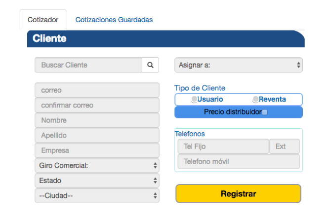
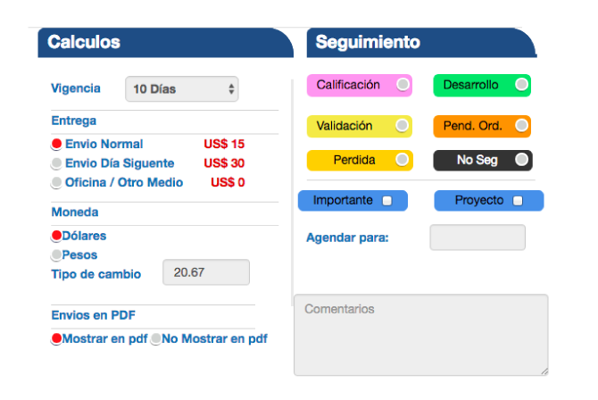
The final result consisted of two different but interconnected CRM platforms: one for the users and their purchase experience, and another for the internal staff and the logistic processes. The first one is focused on achieving a fast and effective sales process: from finding the products on the webpage, to generating an user in two steps, to get an accurate quotation with delivery times based on the real time inventory and, finally to make the payment or contact and executive in case of requiring more information. This has reduced the ordering time, increased the company sales and helped with internal productivity, as the sales staff spend less time on the quotation and more on the communication process with already interested potential consumers.
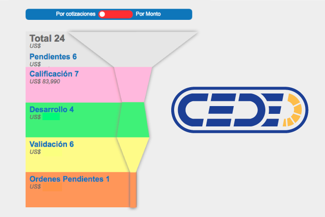
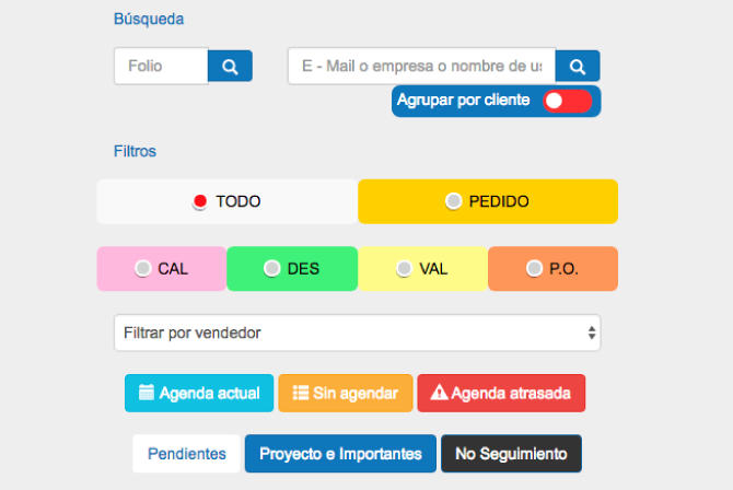
The second one was developed to have clear visualizations of all the information, cycles and processes that already existed in the company but that were difficult to analyze or access before. Now the different areas can communicate with ease, the teams can perform their tasks in an optimal way, the inventory and accounting areas can update information in real time, the projects and leads are better structured and the goals and progress of each member can be monitored in a user friendly solution.
- Collaborators: Juan Carlos Raymundo
- Client: CEDE
- Date: 01/2014 - 06/2015

